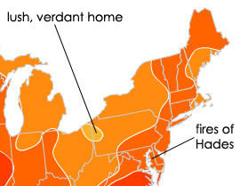
A helpful illustration
 The Eastern Shore is the hottest place I’ve ever lived. This is a fact: it is usually 10 to 20 degrees warmer here than it is at home in Western PA. It’s no end of fun to remind my family of this when they are buried under sixteen inches of snow or getting frost-bitten at negative twelve. And it’s really enjoyable to get Spring in the middle of March as opposed to the middle of May.
However, when summer strikes, it makes me want to die. I seriously wilt under the heat. I go delirious while pumping gas. I throw up during the first few hot days (no lie – it happened two years ago, last year and this past Monday.) My body is just not made to handle so much direct sun, so much humidity or so much sustained heat.
Thanks to NPR’s new energy grid interactive map, I am able to prove to you visually that this is not all in my head. When looking at the solar power potential map, I noticed that not only am I from a lighter shade of orange (lower solar exposure) but from an anomalous blob that is TWO shades of orange lighter.
Not that it helps at all on 100º days…


