Yeah, really?!
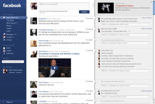
TechCrunch asks “Why Doesn’t Facebook Look Like This?”
For reference, “this” looks like this:
Designed by a firm called iA, the concept is brilliant in my humble opinion. All aspects of the interface finally have a point and a coherent design theme (the mail/communications idea.) Additionally, look at how much more touch friendly something like this promises to be!
So, for all of you who find Facebook to be more and more confounding with each passing revision, you aren’t losing your minds. And we can take heart in knowing that the same cavalier attitude towards user experience presents a chance to do something radically better. To quote TechCrunch:
But Facebook, perhaps more than any other web company, is good at knowing when to [..] ignore user complaints and push forward, to improve the product.

