Back in London: DeL 2015
First off, a note to my future self. If you aren’t me from a point beyond this one in time, please feel free to skip ahead to the actual trip recap. Now that it’s just us, Nick-to-be, please remember that traveling to the other side of the Atlantic for both a conference and to catch up with multiple friends is great. But following it up with a 19+ hour travel day and then four trips to campuses is not really advisable. Not if you want to be coherent during the next week. And you like being coherent.
Reflections
While it was a short affair at just two days, Designs on eLearning offered an extremely rich experience for attendees at the 2015 conference in London. Having attended for the first time last year in San Marcos, Texas (to present on the Palmer Guide project), I was curious to see how DeL would adapt to the decidedly different environment.
I was not disappointed.
Sessions were remarkably well-curated and presentations built nicely off of each other. The inclusion of day-ending student keynotes was stupendous, especially since the students themselves were incredibly adroit and engaging. Conversation, across the board, was thoughtfully skeptical, prompting attendees to ask tough questions about technology access, implementation and necessity both in session and in hallways. And, speaking of hallways, the venue, Central Saint Martins was inspiring in and of itself, all of the above not-withstanding.
Some particular highlights for me included:
- Kathryn James of Edinburgh Napier University shared her doctoral research which focuses on the adoption of technology in teaching practice. By focusing on understanding the “lifeworld” of each academic involved in her case study, Kathryn was able to get deeper into the day-to-day of faculty in the humanities. What she learned confirmed for me one of my own observations: instructors refer to themselves as “luddites” as a defense mechanism and avoid technology not just because it makes them feel vulnerable, but also because many technologies made mandatory aim to provide an administrative benefit to the institution, not to their teaching. Kathryn has synthesized these findings into a recommendation that ed-tech professionals shift focus towards “discipline enhanced technology” – basically, tools that are chosen and supported for the purpose of furthering an academics’ teaching of their field of expertise. At the same time, recognition of negative feelings caused by experience taking a back seat to familiarity with arbitrary tools needs to be always present when taking part in any conversation around adding tech to a course. This was possibly the best session I’ve attended at any conference – I seriously had to fight the urge to give a standing ovation.
- Ahead of our presentation in the afternoon of the first day, Ann Luther presented on her own research project called ENTITY MAPPER. A cross-institutional project between UAL and Parsons, ENTITY MAPPER allows users to input coded qualitative data sets and then visually sort them in a fluid online interface. The entire project was created out of Ann’s need for a tool with a better interface for mapping her own data – and a refreshing “I’ll build it myself” attitude towards getting one. I’ve already been talking with Heather about possibly using ENTITY MAPPER to analyze We Listen stories and really think it’s got amazing potential.
- As mentioned, the student keynotes were all excellent – in fact, possibly better than many paid keynotes I’ve encountered. In particular, Jon Clair’s presentation on the quantum nature of the creation of art in a digital/physical world was both graphically excellent as well as very thought-provoking. The audience definitely seemed to enjoy picking his brain about how to build lab and studio spaces in future. Gabrielle Edlin, on day two, shared a hard-hitting presentation focusing on equality, sexism, gender performance and harassment in the online space and how digital creativity might be used to change the conversation by flooding the multitude of information channels with the right message. I hope these sessions were recorded with the intention of making them broadly accessible as they really show what level of presenting is attainable for students. Our students included.
Of course, the real reason I was there was presenting with Heather Hughes on our work with We Listen and specifically the early programming in Pittsburgh at the Penn State Center. (If you’re just tuning in on this topic, you can start here and work your way forward through this post and then this one to get caught up.) First off, thank you to Ann for ending just a bit early while presenting on ENTITY MAPPER and to Charlotte for being a benevolent timekeeper: those extra minutes let us get through all of our video examples, of which there were many. Heather really did yeoman’s work laying out the history of the program and unpacking its ethos and implementation trajectory. Jumping in at the Pittsburgh portion, I had the pleasure of talking the attendees through the summer LArch internships and the fantastic projects Jeff and Emily put together (entirely without being mandatory, I did not fail to stress). We had fantastic questions from the audience and then many conversations with lots and lots of great feedback – from a chat with fellow Penn Stater, Rose Cameron straight through to dinner at LASSCO Ropewalk that evening.
Tourist Time
Getting back to London for something like my fifth or sixth time was pretty wonderful, especially since I finally felt confident completely in getting around. With an Oyster card in hand and not nearly enough hours to spare, I stormed through 25-30,000 steps a day worth of exploration. Heather and I started out with lunch at Inn the Park, my favorite spot and one I’ve been to on each visit followed by a stroll around St James’s and Green Parks. We also got in a visit to the Tate Modern and tracked down fish and chips before hitting the town in Soho with a new friend from Texas State University, Maia Wright.
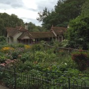
- just one of many reasons I love St James’s Park
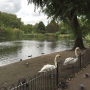
- hello there, royal water fowl
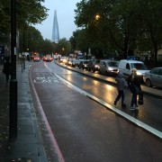
- The Shard watches over a very rainy evening
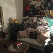
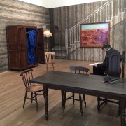
- arriving early had me pondering furniture shipment
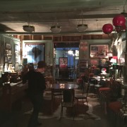
- Heather explores the dinner scene
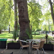
- the lovely park café across from Hotel Russell
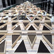
- an installation in progress in Turbine Hall
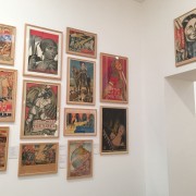
- Soviet posters in the Tate Modern
- a real old man drawing in an installation room
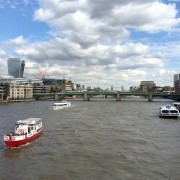
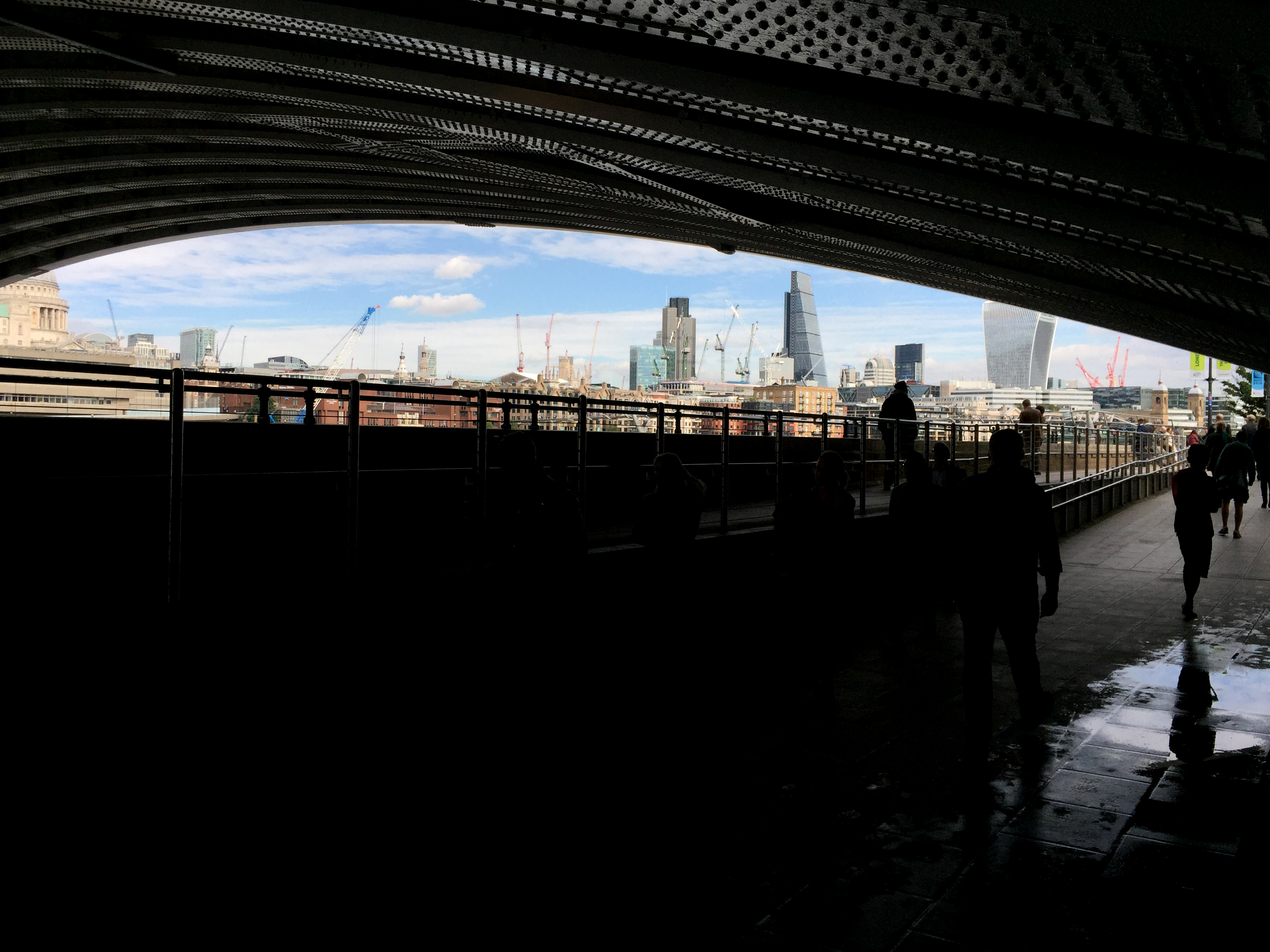
- from the Millennium Bridge
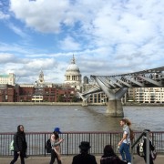
- a view of the Millennium Bridge – and steampunks
Naturally, I also relished in the opportunity to catch up with my friends Ben and Andy, transitioning to staying at their newly renovated flat at the end of the conference visit. They graciously took me out to see Pomona at the National Theatre followed up with a requisite late dinner at Ben’s favorite, Joe Allen. And, since my time in town just happened to coincide with the arrival transplantation of yet another friend, Susan, I was able to get in a daytime visit and dinner out with her, as well.
The only downside to all of this is, of course, desperately wanting to go back – or at least get caught up again on both email and sleep. Until next time, London…
