Category Archives

Art

Future fashion takes shape

The Fits.me mannequin may be the most cleverly futuristic piece of hardware I have ever seen.  It is a torso equipped with motorized panels that can approximate a wide range of male body shapes.  Clothing retailers can use this to create a database of photos of their garments and when a customer enters in their measurements, the correct photos is culled up.  It works like this:

See?  Genius.  Never wonder what size is going to look best on you again!  As someone who is often let down by unnecessarily boxy menswear, this could save my ass while internet shopping.

(From my work blog, via Engadget)

The set of your next Clive Owen film

Apparently this is Gagra, on the Black Sea. According to io9, it used to be a Soviet resort town until military action and political instability brought it to the edge of ruin. Now it just sits there, beckoning a director to make it the backdrop for her next post-apocalyptic summer blockbuster.

My ideal television experience

If you aren’t watching Bravo’s Work of Art, I highly suggest that you start.  The premise is described as such:

In each episode, contestants are faced with the challenge of creating unique pieces in a variety of mediums such as painting, sculpture, photography, collage and industrial design. The weekly assignments are exciting, original and will challenge the artists’ to push the limits of their technical skills and creative boundaries.

A slightly less flowery way of defining the show would be Project Runway for visual artists.  And, by virtue of not being on Lifetime like Runway is now, the show benefits from the caliber of editing and production that PR used to have.  If that wasn’t enough, it’s hosted by a woman named China Chow, a name that begs the be shouted, as the commentating gays at Tom & Lorenzo pointed out. (Personally, I think her name sounds like a dog food with Asian flair.)

Anyway, I caught a marathon of this what-I-thought-would-be-a-train-wreck-but-is-really-stupendous show over the 4th and have been hooked ever since.  As Kate says, it’s a little like watching a room for of people like me.  The artists are all methodical and, despite multiple neuroses, highly willing to help each other out and offer encouragement.   Even the Tim Gunn stand in, Simon de Pury does a fantastic job offering mentorship and zippy little Swiss-flavored one liners.

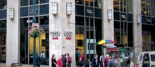
After a four episode binge, I was jonesing for this past week’s installment.  Arriving back from vacation on Thursday, I dove right in.  And what awaited me was perfect.  The artists were asked to travel the streets of New York in a fleet of Audis – Q5s and S4s – before arriving at the Audi Forum in Manhattan.  *jealousy* They were then given half an hour to explore the dealership and come up with an idea that would translate the NY experience and time in the cars into an art work.

While the idea sounds sickeningly commercial, I will point out the BMW art cars as precedence.  I will also say that the works this week are starting to exhibit the symptoms of overtaxing the creative process.  That being said, my favorite contestant, Miles was able to again knock it out of the park.  With the connections this show clearly has, it can only get better from here and I can’t wait to see where we go next week.

China Chow!

Pixels in the round

Pixels didn’t have to be square.  Like Frankenstein’s monster, it’s just how their creator made them.  In digital imaging’s fetal years, Russell Kirsch decided to choose an arbitrary shape for a unit of visual media.  And thus the pixel we know and love was born.

“Squares was the logical thing to do,” Kirsch says. “Of course, the logical thing was not the only possibility … but we used squares. It was something very foolish that everyone in the world has been suffering from ever since.”

As was Kirsch’s regret.  Regret that he is now rectifying with software that can minimize the shape of square pixels by resampling them into more complex shapes.

Don’t fret too hard, Russell.  We’d never have Diesel Sweeties without your mistake.

RootsxDouglasCoupland

I love Douglas Coupland, having read Microserfs more times than I can count since middle school. I love Canada, having visited Toronto all throughout college (how I miss being just a few hours from Canada!) And, of course, I love both telecommunications and fashion in equal measure. So reading the following in an article on Alt.Engadget was like watching worlds collide:

Douglas Coupland may be best known as the author that popularized the term “Generation X,” but he’s also an artist, a designer, and a Canadian, so it makes a bit of sense that he would team up with that most iconically Canadian clothing retailer, Roots, for a new clothing line […] inspired in part by Canada’s history in telecommunications, and by Coupland’s idea that “what really links Canadians together is that we’re all far apart.”

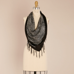
Brilliant! The collection can be preordered via Facebook and features lots of tech-prints like television test patterns and matrices. There are also wireframe beavers on t-shirts and more than a few shopping totes in loud neon colors. My favorite item of all, the motherboard scarf, doesn’t seem to be available online (I hope just “yet.”) Prices for everything else are reasonable – gift, anyone?

Moon art? Yes.

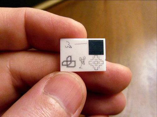
During the 1960s, Bell Labs asked six artists – including Warhol – to submit drawings that were shrunken and printed on a tiny tile that was then shipped off to the moon in secret. This is the awesomest story I have ever read.

Thanks to io9 for reporting on this – and the upcoming PBS documentary on it!

Advertising right, Korea

Caught this tonight while reading up on the new iPhone and doing some freelance work. Absolutely stunning – completely stopped me in my tracks. Shouldn’t all tourism ads be this brilliant?