Category Archives

Art

McQueen is dead. Long live McQueen.

Alexander McQueen, fashion designer and visionary artist, is dead at 40. From his insane wax lipped models to Björk’s sequined face at Fashion Rocks 2003, McQueen has always “gone there” and then kept right on going, out into the dark realms other designers wouldn’t even venture (except maybe Karl Lagerfeld, but he lives there anyway.)  While his style has been over the top, McQueen always managed to keep it luxe.  He really seemed to be catching on in the mainstream of late, with his McQ line and the attention garnered from Lady Gaga.  Alas, we’ll never see just where he would have traveled next.  A sad loss indeed.

I recommend watching Björk’s “Alarm Call” video, directed by Alexander McQueen.  You can wear your wax lips while you do, if you so choose.

Comics (and print media) on the iPad

You may have noticed that I’ve been entirely mum on the topic of the iPad over the last few days.  Well, the truth is, I desperately want one and will probably early-adopt a brand spanking new iPad into the house as soon as I can.  However, I haven’t really said much on the topic because I’ve been disappointed with a) the number of iPad hate posts that have been flooding my favorite blogs and news sources and b) the creativity of demonstrated apps from the Apple keynote presenters to developers in general.  The iPad has the potential to be THE electronic reading device and I was promised truly revolutionary, mind-rattling content that was just not delivered

However, digital comic book publisher, PanelFly seems to have its head in the game in a big way.  I’ve enjoyed their iPhone app thoroughly and I think the business model of comic sales in-app on a mobile device is brilliant.  I mean, it’s the perfect thing to sell someone who is probably looking for something to tide them over on the train, in the car (not driving) or in queue for the next cashier.  (I’ve talked about this in relation to iVerse, a similar idea, at my work blog, too.)

What makes PanelFly’s move to the iPad so delicious (and logical) will not only be the same things that make the iPhone app great: backlighting, control of reading experience, flexibility of reading experience, animation and a beautiful display for art.  Instead, it will be the innovations only possible with a large screen, fast processor and slant towards sexed-up traditional media consumption (vs. its sidebar position on the iPhone.)

If Gizmodo’s preview of the technology – and the collection of screenshots from PanelFly – are any indication, this will be huge.  And hopefully a preview of what the rest of a race of dying dead-tree publications will look like as they rise from the ashes.  I’ll own the iPad anyway…

Two great posts from Gizmodo…

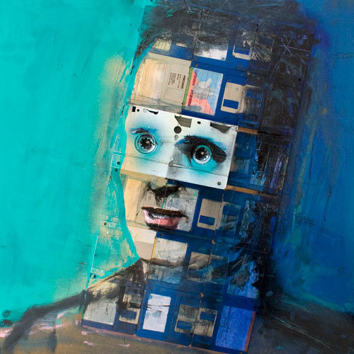
Another sick day means a bit of web browsing. I found two particularly great posts without venturing any farther than Gizmodo today. The first is an unbearably adorable comic, originally from xkcd. Too cute for words. The second is a compelling collection of floppy disk-based paintings from artist Nick Gentry. Check out the images below or head over to either of the articles.

The best of yesteryear

I have just recently been reminded (again) of the existence of Retro Thing. This time via Engadget’s posting of a vintage 1983 Sony CD stereo review. Not just a collection of funny old verbiage about dead and dying gizmos, there are also some really artsy and thought-provoking artifacts. Take this video of San Francisco from the 1958:

San Francisco 1958 from Jeff Altman on Vimeo.

Of course, it doesn’t hurt that they are leading with an article with the Lego Architect Fallingwater set – which I may or may not have received for Xmas.

Read: Not So Distant

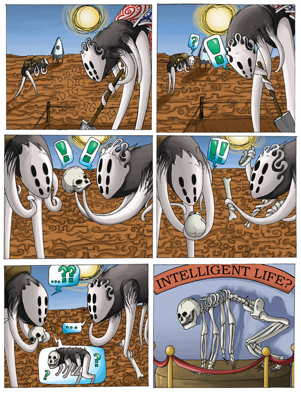
Kate today recommended to me a brand new webcomic by the name of Not So Distant. She had seen it on Aaron Diaz’s Dresden Codak, a not-often updated but sublime comic itself.

Here’s the first panel:

It’s a story about a young alien archaeologist studying the remains of a dead Earth. Or is he? I’m about halfway in right now, so there’s still some mysteries that I need to unravel. But it’s riveting and whimsical at the same time, so I’m hooked.

Luckily, we are only about 75 panels in, so it’s still possible to get caught up! I absolutely hate feeling like I’ll never be able to read the new installments because of an insurmountable backlog, so that certainly made getting into Not So Distant a lot more palatable to me.

Listen: Science Fiction & New Media

I don’t normally go in for podcasts (sorry, podcasters) but this episode from the smallWORLD has actually been a pretty compelling listen. So far, I’ve only gotten through the Cory Doctorow interview, but I’m definitely looking forward to hearing what Annalee Newitz has to say since I love io9 so very much (and she’s the editor.)

Things get fascinating at around 16:00 for Mr. Doctorow, when he starts talking about e-Readers and then turns completely controversial as he moves in to discussing ownership, customer-war and Apple. Good to hear an author that’s in to the idea of digital distribution being free and open and not entirely terrified of never getting paid again if/when this ecosystem comes about.

Worth your time, most certainly, whether you produce media, support producers of media or just consume the media they produce.

Update: when you hit the 53:00 mark or so, you’ll find J.C. Hutchins talking about trans-media artifacts.  This makes me beyond happy.

Blog find today: The Sartorialist

I was browsing about this afternoon, looking at uses of Posterous, a service that had escaped my notice and was luckily pointed out to me by my coworker, Nancy (“gold star for the day,” I told her.) In this state of wide-eyed absorption, I fell on to The Sartorialist, a blog that chronicles what’s being worn on the streets from New York to Cologne to Paris and beyond. It’s like walking through the city, staring at the stylish and beautiful without all the awkward eye contact (or walking.)

As someone that would like to believe himself at least a little fashion-forward and marginally on-trend, it’s refreshing to step out of Corn Field, MD and into the world. Because we all know I’d be this guy if I wouldn’t get dragged into the back of a diesel F-250 for doing it:

1039GreysBlcks2962Web

Would that I could...how I envy you, random Parisian.

Update: as if hell-bent on proving my point, I found this moments later from the local “newspaper:”

Screen shot 2009-12-03 at 12.58.28 PM

This car game that I play

As a design geek paying absurd amounts of attention to the world of cars, I sometimes find myself wondering why I’m reading auto blog x again or paying $12 for a copy of UK Top Gear or Car magazine. It’s going to be the same thing as always: reviews of hypercars I can’t afford, pictures of vehicles that aren’t on the US market, concepts that are dolled up to the point of insanity, etc.

I keep reading. And reading. And reading.

And sometimes, like yesterday, there’s a pay-off. Audi debuted the new A8 at Design Miami – with Lucy Liu as emcee, no less – and the event was the perfect opportunity to not only gush over the gadget-y goodness of this new barge but also to put to use a crazy level of knowledge about the design direction the car takes.

First, the car. A few of my favorite images for you.

A8090115

2011 Audi A8

A8090119

Those headlights. God damn. I can't wait to see the full LED lights at night. (If I'm run over by an A8, this is why.)

A8090107

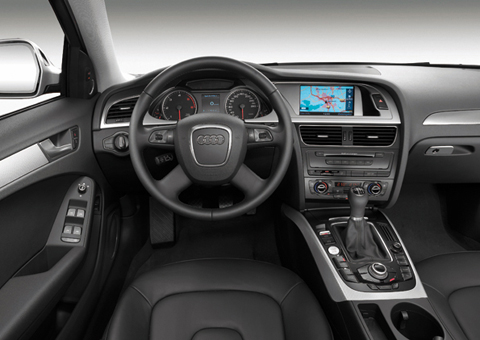
And the interior is jaw dropping in its serenity and cohesive use of shapes and materials. Blows the doors off this:

Audi_A4Interiorl

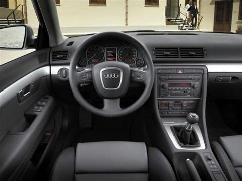
Fuck you, 2009 A4 interior. Why are half of those buttons where they are? What's with all the chintzy looking cheap plastic? Especially since we started here:

TorqueOmata2157

Soothing. Logical. Clean. Simple. (And a 2005.) Stop chasing BMW because they are the only ones that can do crazy and asymmetrical.

But I digress. Sorry about that tangent. The message I’m trying to get across here is that the new Audi A8 is absolutely beautiful. What’s more, it’s a direct descendent of a recent show car, the 2009 Audi Sportback Concept.

2009-audi-sportback-concept-0015

I absolutely love that you can see the waterfall grille evolve its shape in this concept and find it applied in the A8. And they one upped the lights.


2009-audi-sportback-concept-009

I do prefer the angles and curves of the concept to the final A8, but this was supposed to pave the way for a more curvaceous (and younger) model, the A7 so I can understand the more grandfatherly finished product.

Imagine. A concept turned to reality. And my joy at paying enough attention to see it happen.

If you’d like to see more about the Audi A8, Fourtitude is carrying some of the best photos of the launch and will certainly be chiming in with thoughts soon.

I just hope that some of these innovations make their way down to the A3 by 2012.