Media Commons Redesign (2017)
Redesigned during the Spring 2017 semester, the new Media Commons website leverages a much more robust theme with modern design principles to present just-in-time support services, planning tools and media resources to users from across the Penn State community – and around the world.
- Category
- Information Design, Instructional Materials, Web Development
- Skills
- collaboration, graphic design, information synthesis, project management, promoting client success, web design, writing
- Project URL
- mediacommons.psu.edu

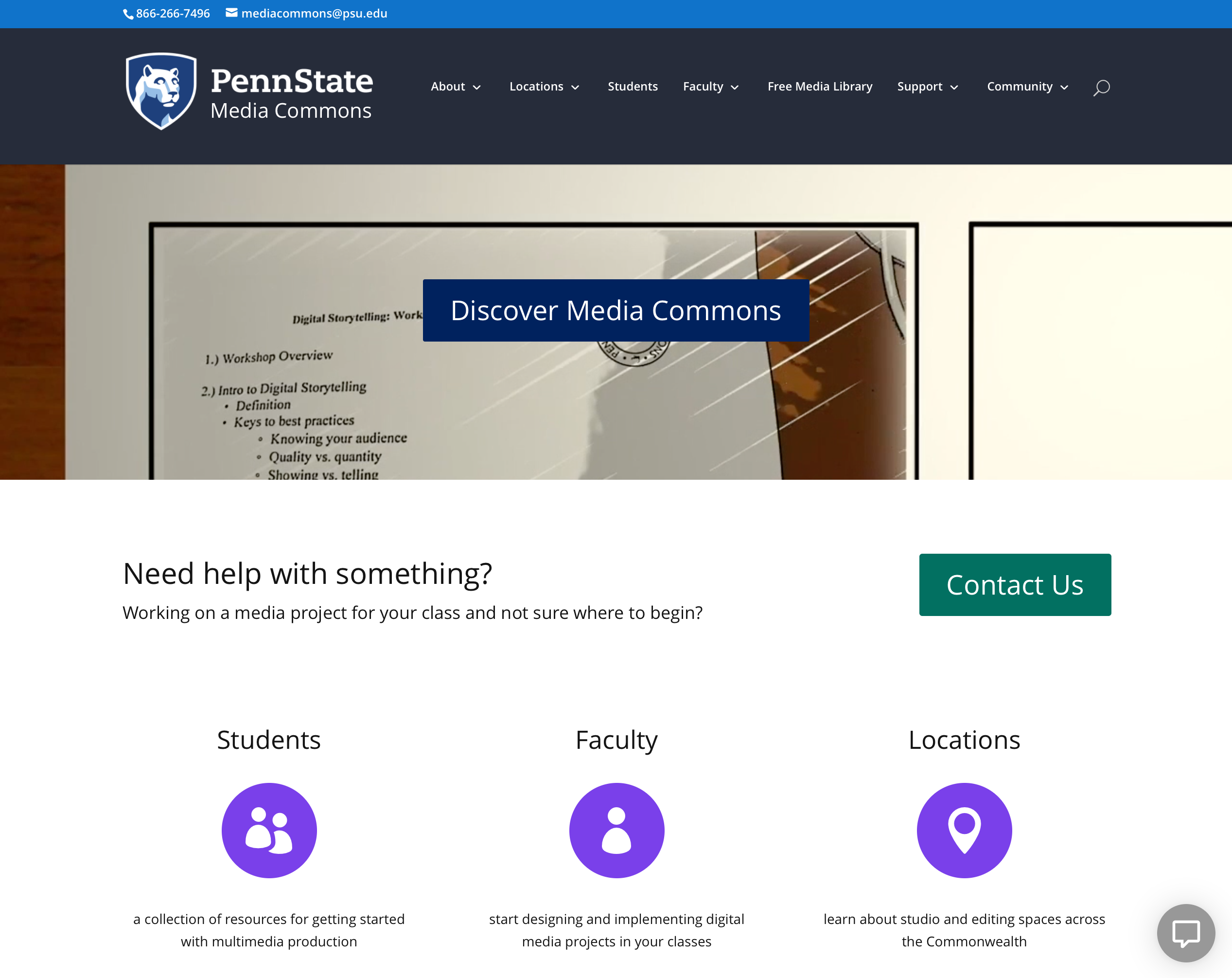 The new Media Commons homepage integrates an updated grid of service icons, video banner and refined navigation
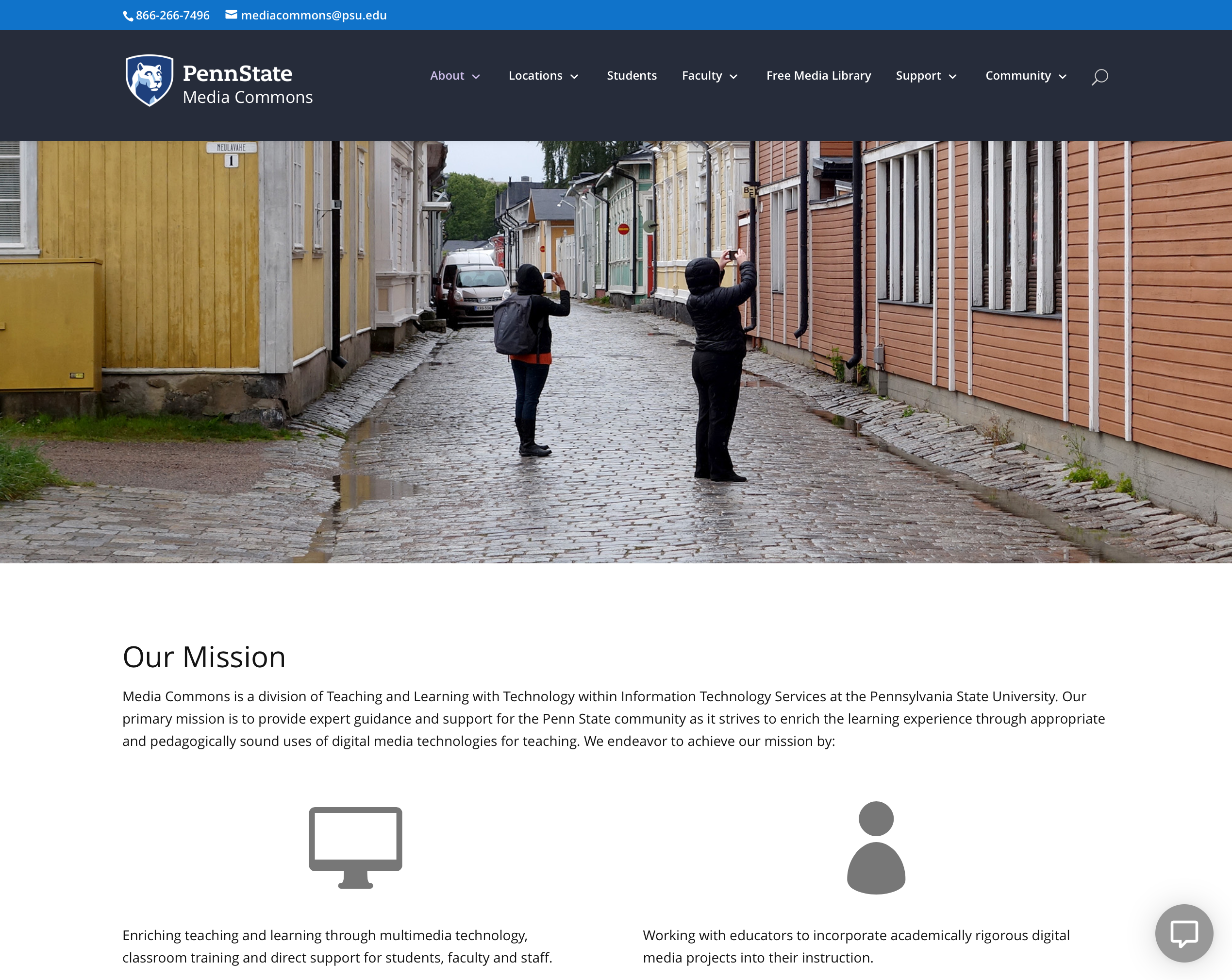 Big, bold photos help tell the story of our About section
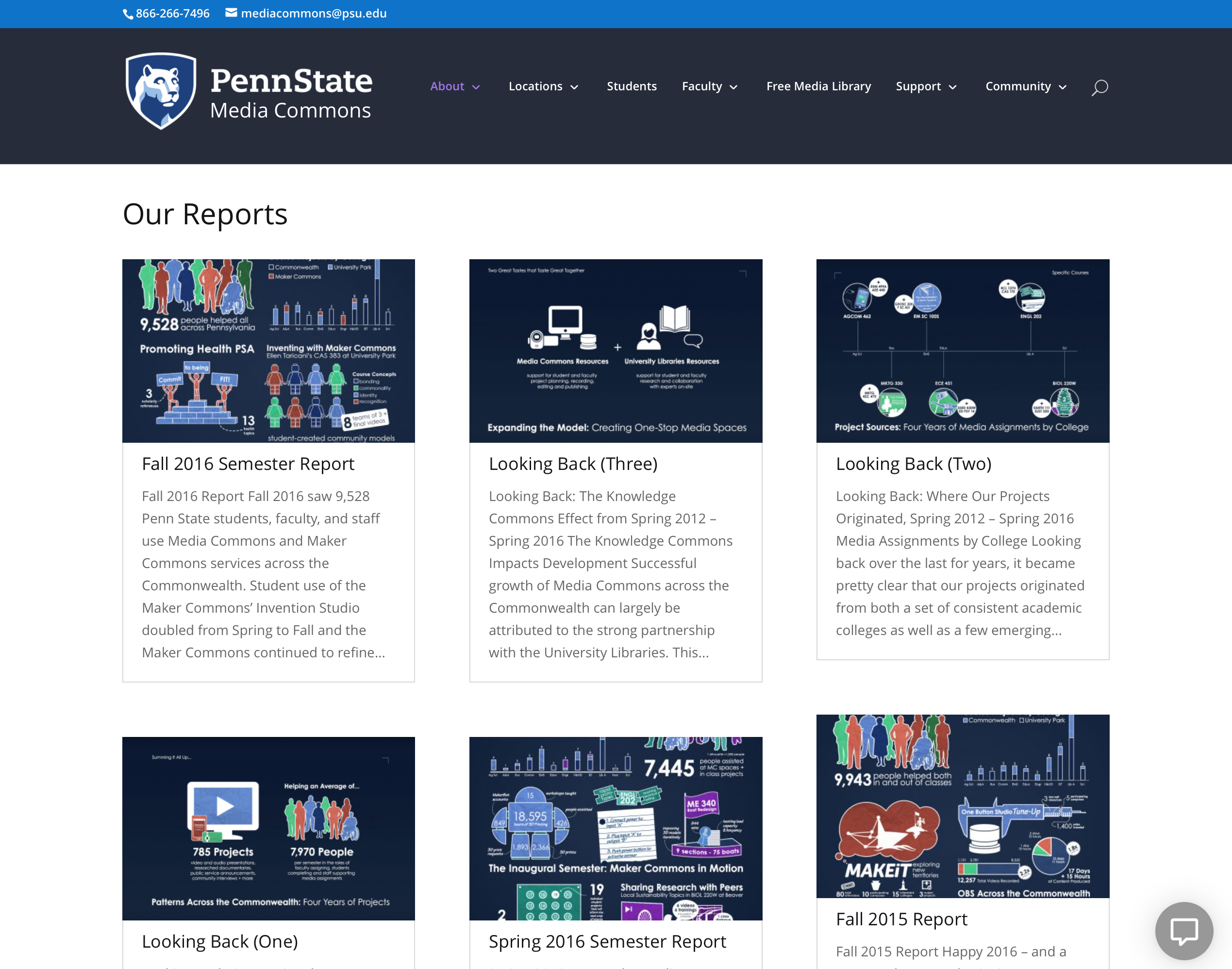 Reports are now showcased with their infographic “covers” in a category carousel
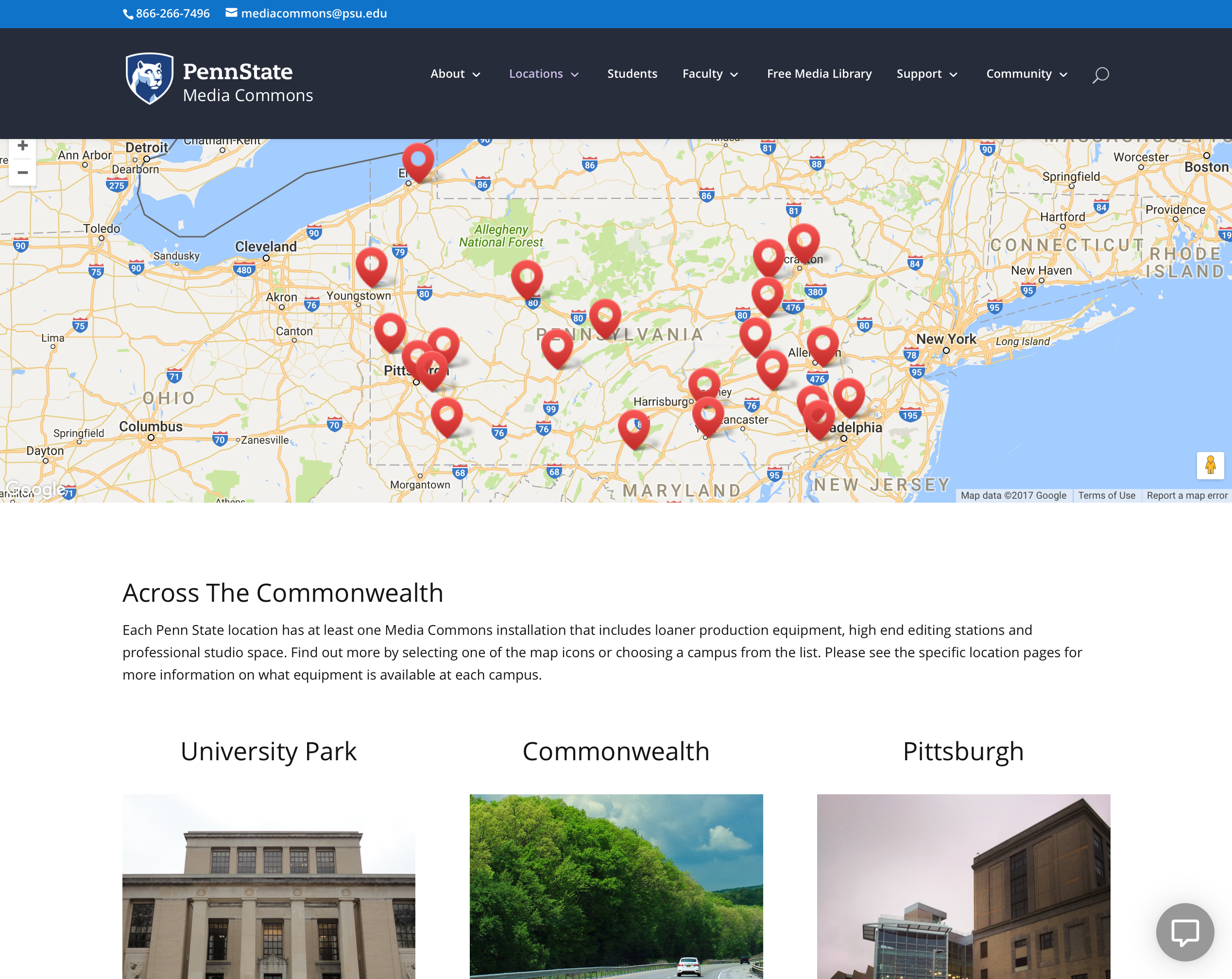 University Park, Commonwealth campuses and the Penn State Center are given distinct representation on the Locations landing page
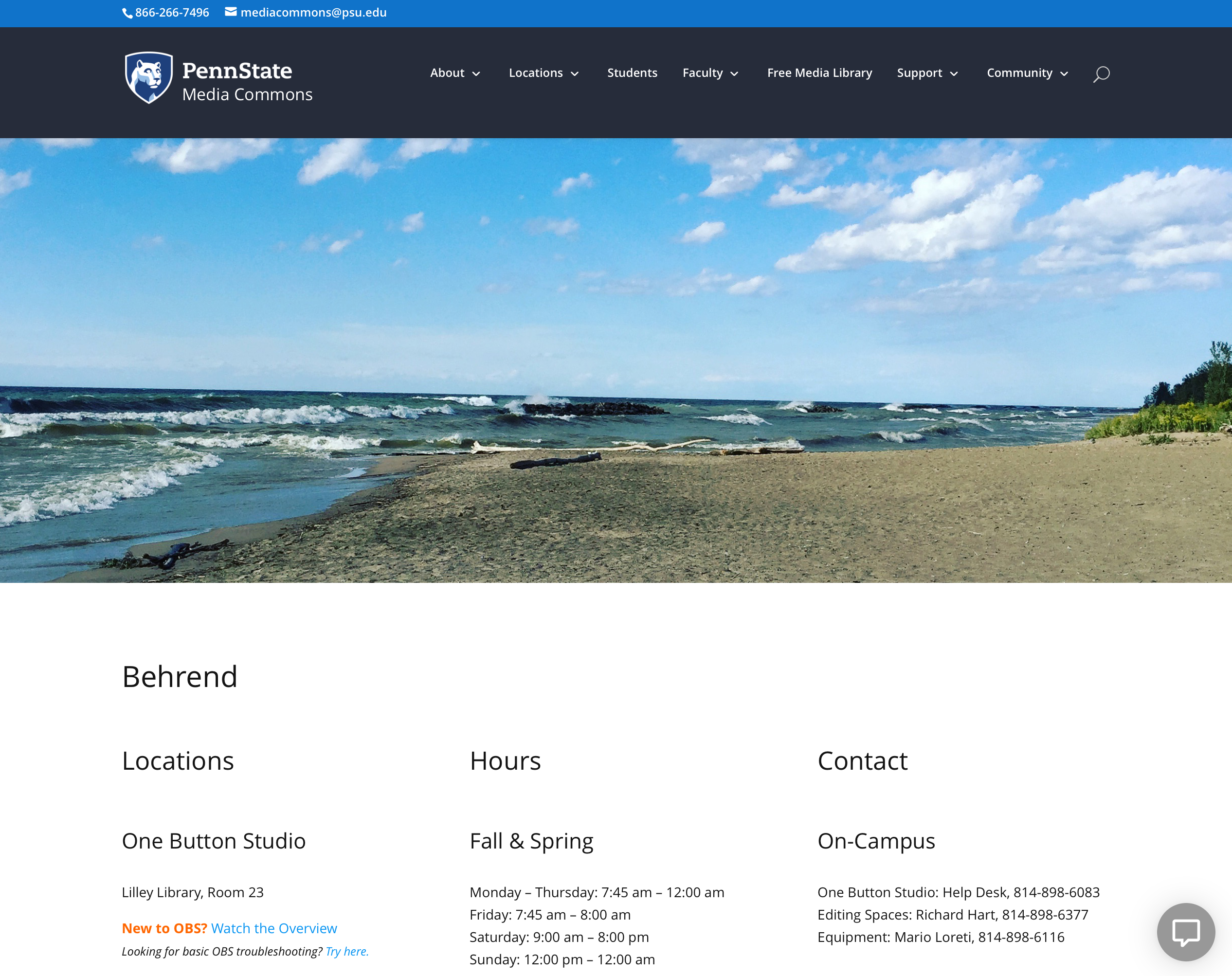 Revised location pages make use of imagery that invokes a sense of the surrounding region
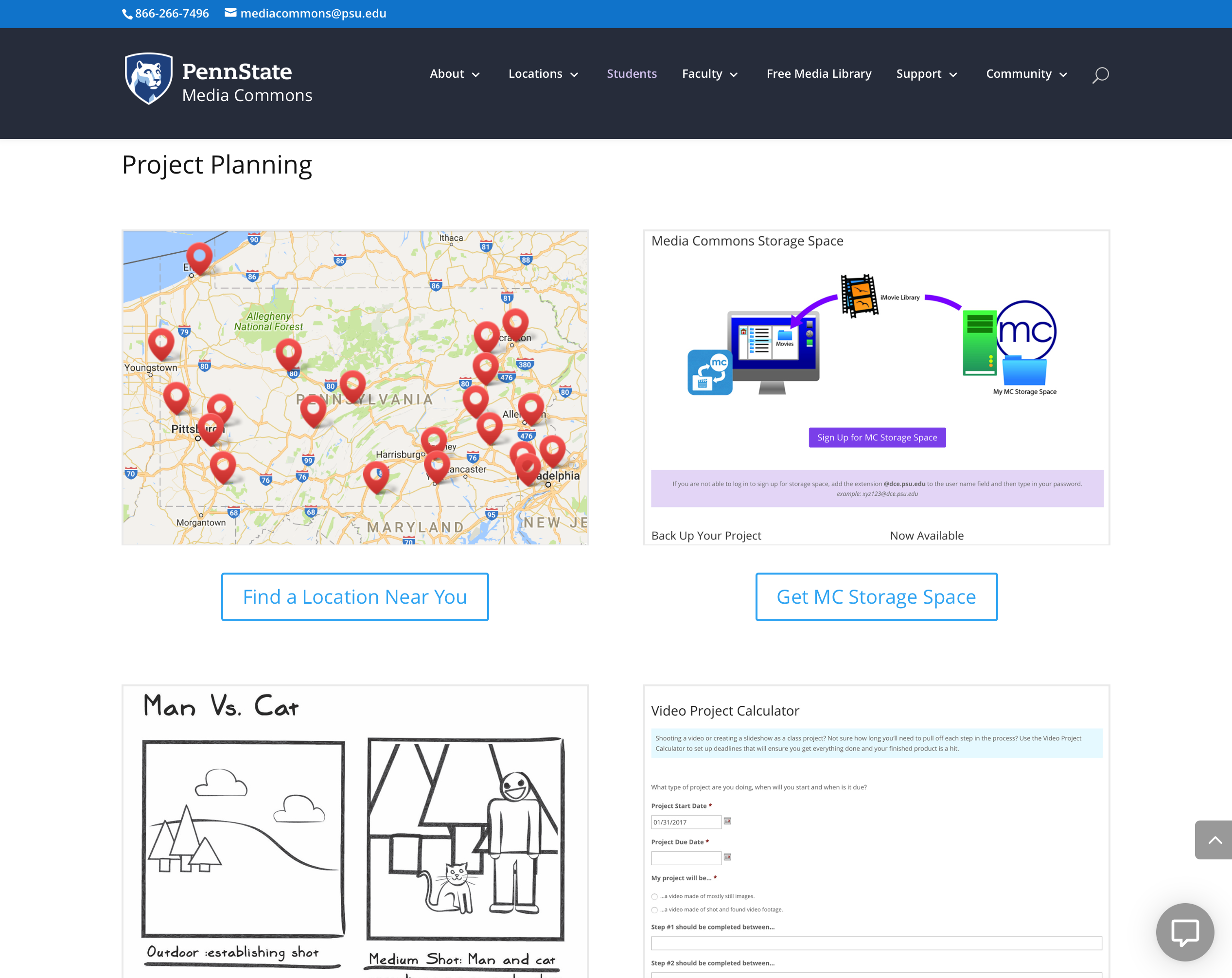 The Students section wears a cleaner look and has been updated with the latest materials
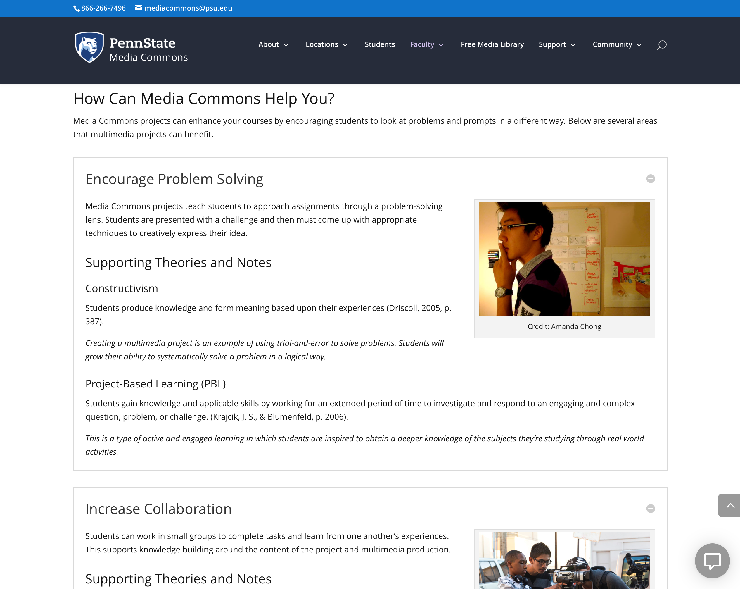 Faculty can get in-depth about how media projects impact learning with tailored resources
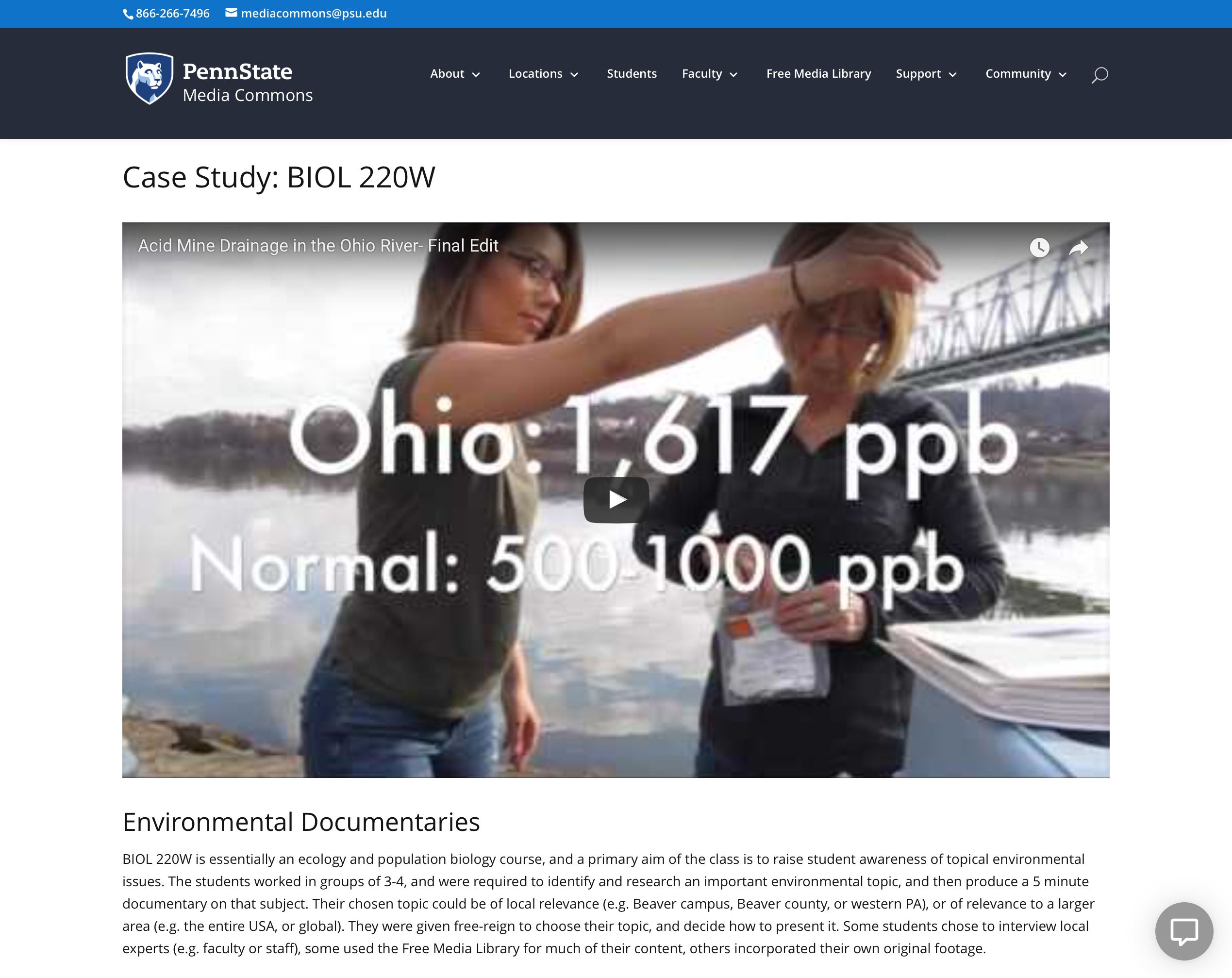 Case Studies inform how others have deployed media assignments – and celebrate successful student work
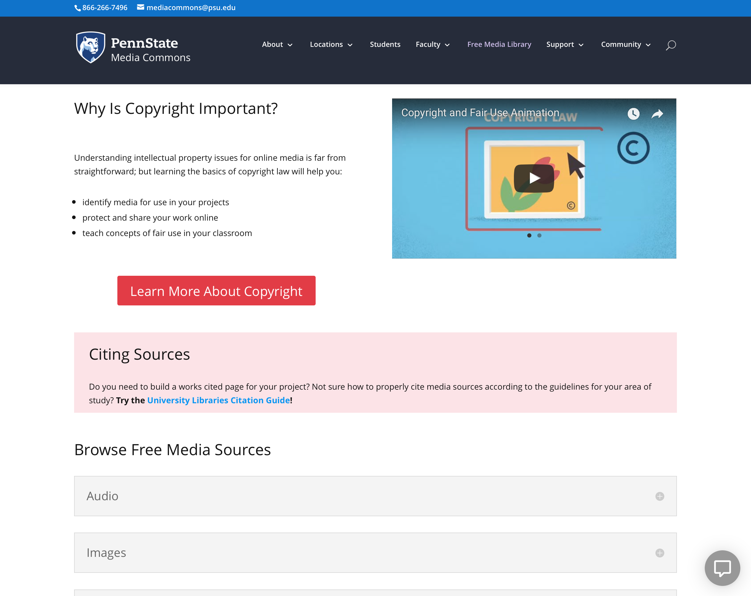 An overhauled Free Media Library sees collapsible content categories and more informative intro materials
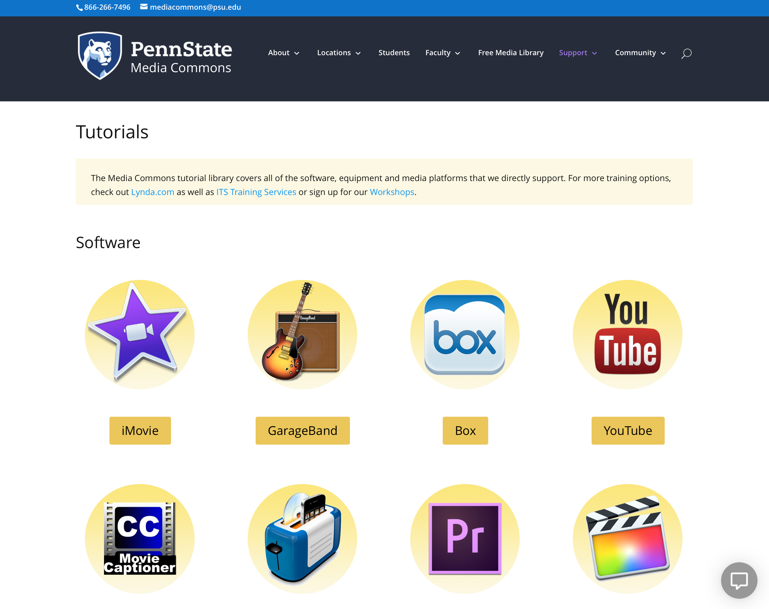 The Tutorial Library has been retooled with a consistent iconography and accessible buttons
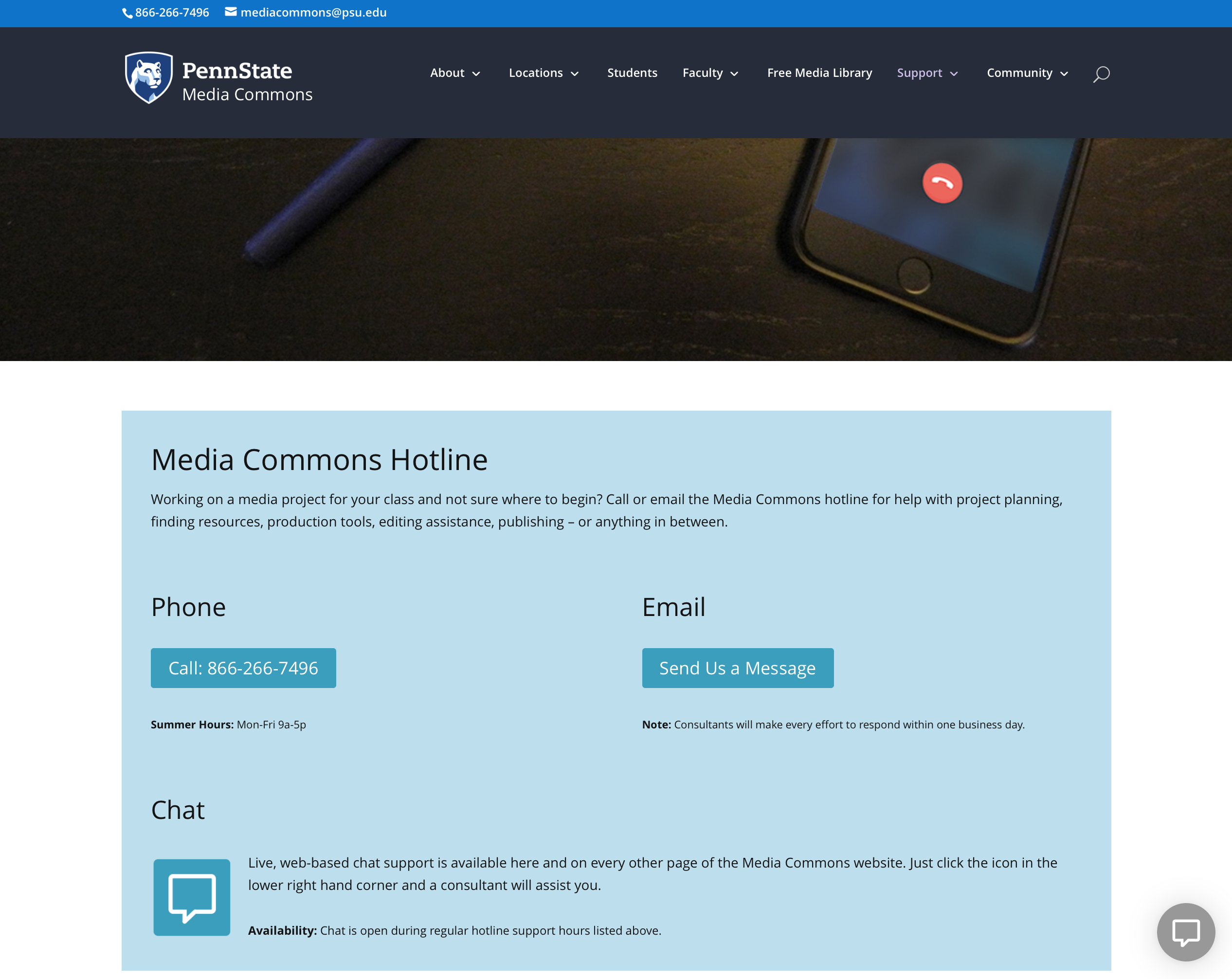 The Support page replaces Contact Us, mirrors the design found on the sibling Maker Commons site
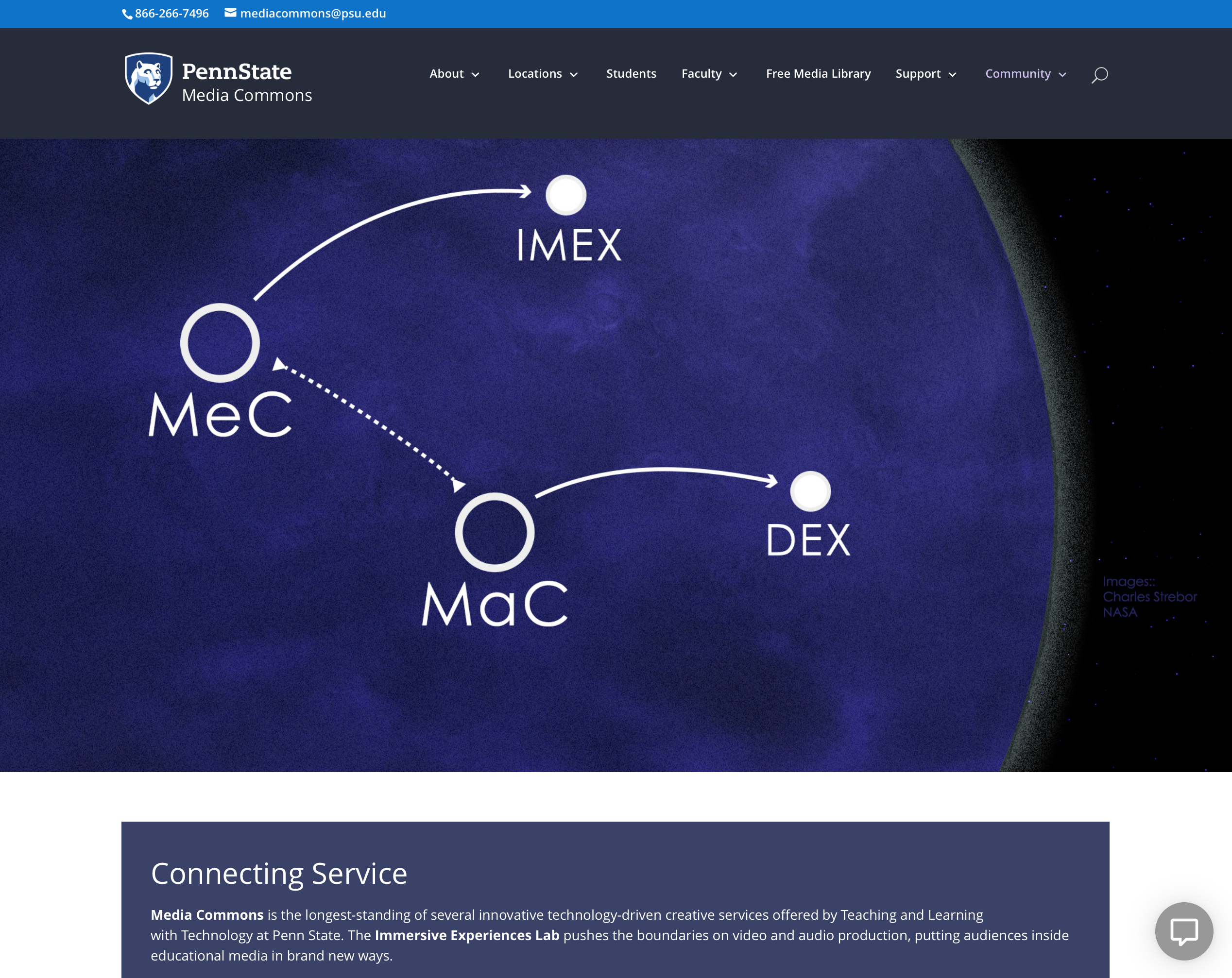 Relationships between connected services are explained on the Community landing page